Friday, 3 December 2010

Risk Assessment


This is the Risk Assessment we made for the location of our trailer. Jess works at the Young Actors Theatre so she knew the location very well and also had access to the information we needed. We filled in the table together making sure we had covered every possible risk. We went to the Theatre and found a fool plan of the building. This made it easier to discover and locate risks. It was very helpful when trying to find fire exits and extinguishers. Having our Risk Assessment made us more relaxed when filming because we knew what to do in case of an accident.

Sunday, 28 November 2010

Audience Feedback

After making a rough edit of our poster and magazine cover we wanted to ask some of the other students in our class what they thought and what they might have done better. People in our class are also part of our target audience so their feedback is very valuable.

Making Horror Movie Poster

Original image poster after final edit
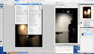
After filming our trailer we left some time to take some photos for the horror movie poster. We had already drawn a couple of rough sketches and discussed what we wanted our poster to look like. We wanted to combined horror movie poster conventions and the themes and iconography of the theatre. The unique selling point in our film is that it is set in the theatre. There is always a lot of mystery in the image for a horror movie poster, it normally does not give very much away. I came up with the idea that we have an image of an empty stage with only a single spotlight highlighting a dead woman holding the mask the killer was in the movie. We decided that this would be a good idea because the concept and the image itself are both very chilling and mysterious. I thought was a good idea that we do not show the killer in the poster. The mystery will build curiosity and make people more intrigued to see a film. Jessica came up with a very clever idea of having people sat in the audience. This enhanced the strange and creepy atmosphere which will draw people to see the film. We decided to have the title on a slight slide to give the idea of chaos. After getting some audience feedback we found out that we had slanted it too much and it was blocking the image so we moved to our. We used Photoshop to edit the image and make it more dark with a lot more use of shadow. Darkness is a very commonly used in horror movie posters. It is kind of like a code which tells the viewer that this is the horror movie. To make it more professional looking and similar to a real movie poster we added in production details.

Second Horror Movie Trailer Edit

After listening to the advice so I have given us and watching our trailer several times over, Jessica and I sat down and carefully went through our trailer adjusting every shot to make it as gripping as possible. First of all we cut down every shot so the viewer only gets to see a short snippet of the action. This will make the trailer of not more rapid and thrilling. We added production details at the end and a production company title at the beginning. These are two things that are always used in trailers to create interest around the stars in the film and the company which made it. We tried to make a film seem more edgy and other horror films. To do this the use of child was very effective. There is a short scene when one of the teenagers offers alcohol to the small boy this adds a new layer of rebellion to the commonly used stereotypical teenage horror film. The use of a child also heightens the drama and raises the stakes. A commonly used convention in horror movie trailers is the sudden and sometimes shocking use of abrupt titling. In our trailer the words break a leg flash up very suddenly hopefully shocking the audience and getting their attention. In the final edit we added the use of the 'wipe in' transition to give contrast to the dark scenery and make the abruptness even more shocking.

First Cut of our Trailer

Filming was very successful. We stuck very close to our schedule and managed to get all the footage we needed. I always set up the camera using the tripod because I made our storyboard and I have a clear vision in my mind of what I wanted the angles of each shot to look like. I tried to use some quite dynamic angles towards the end of the trailer as the shots get more fast pace. Some of the shots towards the end seemed quite disorientating but this adds to the rapid action in the trailer and will build a viewer's interest in the movie. I was in charge of editing the footage. Jessica was very helpful and we collaborated on ideas the whole way through. I have used iMovie many times before and know all about its tools and how to use its devices to my advantage. Before I started editing I looked through all of the transitions and titles together good idea of which ones I wanted to use. Titles and transitions can affect the style of the trailer. I got some very constructive criticism from my teacher. After watching the trailer a couple times over I realised that the beginning is very slow and entire trailer needs more pace. The shots don't have to be long but can still build tension which was a mistake I made with my first edit. This is only meant to be a teaser trailer not a theatrical trailer and does not need to be longer than two minutes. By making the shots very short the audience has enough time to take in what they've seen but are still very curious to see how the story will unfold.


Schedule and Preparation


In order to schedule our time properly we made this timetable on Microsoft Excel. When it came to filming it proved very useful because we knew the timeframe for how long it should take to shoot each scene of the trailer. This meant we could tell actors when we needed them and how much longer they had to work for. It made the entire process a lot more organised and driven. Our timetable also has a list of props and costumes that we may need to each scene. This came in very handy when preparing for the shoot. We used the timetable as a checklist so that we can tick off scenes we had done, props we had used and actors we needed.

Sunday, 14 November 2010

Horror Magazine

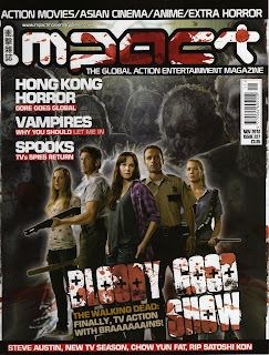
As part of our horror movie campaign we has to make a magazine cover which advertised our horror movie. I managed to find this horror movie magazine in Forbidden Planet. It uses the typical horror movie colour scheme of black, white and red. The title font relates to Japanese horror which is thought of by many to be the country which most goriest horror movies. They have used a masthead to advertise the many articles which are inside the magazine. The image on the front is very different to a horror movie poster image. On the cover of a magazine the images are always a lot more commercial. In this one the stars are standing powerfully in the centre of the image. They are all holding weapons which shows that this magazine is tough and masculine. The clever slogan, 'bloody good show' slightly to it to show the chaos of the movie genre. Every part of the style and layout of the magazine relates back to the horror movie theme