
I also took a screen shot of the Moster House trailer.
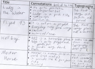
-The colour red is normally associated to things like death and hell. This might tell the audience that the movie is scary or very dramatic.
- The crooked typography shows that the film is spooky. This is a commonly used convention in scary movie titles.
- The way it comes out makes it seem unmoverble and strong. This makes the film seem very powerful and maybe even threatening.
- The way it is coming out of the darkness makes it more mistiryous and spooky.
What is more important images or words?
I think that images and word go hand in hand in an effective movie trailer. The words are very important for telling the audience about the genre and the USP of the film but if you want to build more anticipation and give the view a better sense of atmosphere the words need to be accompanied by a relative font and images.
No comments:
Post a Comment