Tuesday 21 December 2010

Evaluation

Question one;

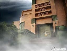
When making our horror movie trailer we paid close attention to the formulas and conventions set up by previous horror movie trailers. The concept behind each character is one that has been used many times before and has proved successful in other horror movies. For example Jessica's character is always worried and often questions what the rest of the group does. She is also the one who wanders off which normally leads to trouble. The idea behind this character has been used in films such as Scream and Psycho. We challenged conventions by using a young child instead of a complete group of teenagers in our trailer. I think this idea was very successful because it gave more of a contrast between the villain and the protagonists and also gave our film more edge because the young boy is seen drinking alcohol. It also raised the stakes and makes people want to see the movie because they want to know if the boy lives. The plotline is a very commonly used idea. There has been many films in which a group of teenagers decide to spend the night in an abandoned building. An example of this is House of Wax. We added our own twist to this plotline by making our abandoned building a theatre. The idea of theatres and putting on shows is an ongoing theme throughout the trailer and the title. The use of fast paced flashing images is a commonly used tool in horror movie trailers. It suggests the film will be thrilling and will have the audience on the edge of their seats. The use of titling has also been used many times before. It is a less cliched way to tell the audience what the film is about and some of the themes it has in it. Here is a short director's commentary me and Jess made together;


When making our movie poster we also tried to stick as close as possible to the codes and conventions of the genre. Similar to other horror movie poster the colours on our posters are very dark. The main colours are red and black similar to the poster for the film 'the Last House On The Left' and many other horror media products. The use of shadows in the image is an idea that is used in nearly ever horror movie poster to create atmosphere. The use of a gothic font is a very effective convention of horror movie logos. We added our own twist to that convention by using a type writer font which has an old fashion style, similar to the gothic font, but we used it because this is the same font used in play scripts. This will link back to the theatre theme. Horror movie posters often show violent, horrific images. We tried to use this convention by showing a dead body covered in blood in the center on the poster. Things like blood and dirt have become iconic to horror movie posters. There are very few that don't use these iconic images.

Before creating our horror magazine cover I did a lot of research in to what the conventions are. I also wanted to look at what the main differences between horror posters and horror magazine covers. I found that the images are a lot less horrific on magazine covers than on the posters. The image is used a lot more to advertise and promote the stars of the film on a magazine. So when taking our cover photo we made sure we showed all the actors faces. They're body language shows they're character. This is similar to other horror covers I looked at. We still used the normal colours code used in horror media products. We used a lot of black shadows to create atmosphere and mystery. We also used the colour red a lot. This is a convention used to give the sense of blood and horror. To link all our media products we use the same logo and the same colour scheme. This is a commonly used idea, used to create more brand awareness.


question two;

Overall I think our film campaign would prove very effective. We have a strong brand image and have used media in an inventive way. We have considered many different horror conventions and have also found our own new unique ways to challenge them. A brand image includes things like colour scheme, logo/font, iconography, soundtrack and themes. By using all of these things correctly to link each different media product we have created a campaign which is difficult to ignore.

Synergy is when you divide your media campaign across the different media products and formats to create more brand coverage. For example showing your movie trailer on TV, the web and before other films. You could also make a wedsite or facebook page. Here as an example of a horror movie wedsite:

http://www.officialsaw.com/

When advertising our film I think it would be important to show the trailer before other films in the same horror genre. Our target audience range from teenagers to young adults. The kind of people who use Facebook and YouTube. So it might be a good idea for us to show the trailer before YouTube videos. We have also created a group on Facebook of the people who've seen the trailer and liked it. Our film will also attract diehard horror movie fans. This is why it was important to advertise our movie in a horror movie magazine which will be read by these kinds of fans. The poster follows conventions by not giving too much away apart from the genre. The title is a contrasting colour to the background and will stand out well among other movie posters. Because of our young target audience is also might be a good idea to give the film its own official website. The Internet is a very good way to link all of our media products. For example the poster and trailer could have the website address written on it. Another example is that the Facebook group could have a link to the IMDB page and vice versa. This kind of linking of media is the best and most effective way to build a strong campaign which is difficult to ignore. These images are two examples of some real live horror movie posters for the two recent films Scream 4 and Paranormal Activity 2 in which they have used the idea of advertising their movie website on the movie poster. This will build interest around the film;


One way we could have improved our trailer, magazine and poster is by having small adverts on the bottom for the Facebook group this way we could link all our media products more effectively.

This is our Facebook group. It proved very useful in getting audience feedback during the production stages: http://www.facebook.com/#!/home.php?sk=group_181316455227151


Overall we were lucky in our production stages because very little went wrong thanks to our scheduling and overall organisation skills. We did a lot of testing and planning at the location before we went so we knew exactly what we were in for and could be prepared.


Question three;


We knew from looking at other horror movies that the target audience is very often teens and young adults. The horror movie genre has quite a large fan following. After we had made the first edit of our trailer, magazine cover and poster we need a Facebook group and posted all of our media products on it. This was a very effective way to get truthful, relevant feedback from our target audience. We got some good constructive comments on our magazine cover from other media students. Lowri commented; 'characters facial expressions really work well, and the font works well with the horror movie genre.' Louise commented on our movie poster; 'really theatrical, works well with the theme of the film.' Comments like this showed us what to focus on and what our audience thought of our work so far.


Another way we tried to build helpful audience feedback is by interviewing members of our target audience. We videotaped some of the more useful and constructive interviews. Here is the video;


Here is a Prezzi I made previously depicting things our target audience might be interested in. Doing this free search was helpful in deciding what we wanted our characters to be like and do in the trailer. Here is the link; http://prezi.com/hwzyt2znl1ip/target-audience/

Here is the link to the Facebook group as well; http://www.facebook.com/#%21/home.php?sk=group_181316455227151

Questions 4;

When doing the blog it was important to use media technologies in clever and helpful ways. For example when I heard about evaluating the location because I had taken so many photos I thought it would be a good idea to add a slideshow. I had never done this before and it was an interesting challenge. I tried to research what would be the best way to put a slideshow on my blog. I eventually found a free website which let me make a slideshow and it also lets me frame it with a movie real style frame. The teacher suggested we use slideshare, but I thought using the web application I used would be more effective and more unique. I found it very hard to get videos onto the blog because uploading full-quality videos took a very long time on blogger. So Jess and I used YouTube to apply our videos to the blog. I tried to use Prezie as much as I could, because I found it a much more fun and interactive way to display information. It took a while for me to get the hang of using it, it is unlike any web software I have used before. But with practice I got much better towards the end. Mostly getting information onto my blog was quite simple and straightforward, looking back I could have maybe used more of a variety of technologies but I felt through a process of elimination it was better to use the ones that proved most effective and produced the desired results. I utilised the screen grab tool as much as I could to show the process of making each media product.

Magazine Cover After Audience Feedback


We did some audience feedback, as evidenced in one of my earlier posts, to see what people liked and disliked about our horror magazine cover. One person said to make it look more like a magazine cover we should give it a masthead. We thought this was a good idea and a good way to add in a kind of catchphrase. Another person said that some of the fonts needed to be changed to make them fit the genre more. We took all of our audience feedback into account and it helped us to make our cover look a lot more professional.

Wednesday 15 December 2010

Stage fright Movie Magazine Cover


Another part of our horror movie campaign to create a horror magazine cover advertising our movie. First of all we started off by taking a couple of different photos of our cast the same day we shot the trailer. We have previously discussed and planned ideas for the cover so when it came down to the day our ideas are well organised giving us a starting point to experiment. Here is one of the pictures we took a how effective a different angle would be before we chose our final image;

I suggested that we use the image in which they are looking straight at the camera because this is a lot more powerful and dramatic.


We talked about what some of the differences might be between a horror movie magazine cover and a horror poster. I mentioned that after looking at the magazine I had bought at forbidden planet it was quite apparent to me that horror movie magazine covers are always a lot more commercial than the posters are. This is most likely because magazines are aimed towards advertising stars and celebrity culture where is posters are more about creating an atmosphere and building interest in the film.

First of all we cropped our original image into a close-up of the actors frightened faces. I think this makes it look more claustrophobic and makes the viewer more intrigued to know what the actors are looking at. Turning the image into a close-up altogether gives it more impact.


Jessica mentioned that she thought the image was not scary enough. I came up with a great way to build more of a horror atmosphere. To add more shadow to the image I added another layer and painted black in all the areas where the shadows would fall and then according to how light or dark we wanted the shadows to be, we could just the opaquency of the layer. We also use this technique to give the flashlight more glare given the image more of a horror movie style and making the surroundings seem more dark in comparison.


The actors are in quite proposed position but the way that Jessica's character is down on her knees makes it very dramatic. This also shows her character as being frightened and concerned. The young child, played by Edward, is clutching onto a sister giving a sense of innocence. The two other characters are a lot more strong and bold. To show this we made them stand up and look a lot more prepared with a wide stance, as if ready to fight. The image is very classic horror
with also a team eliment. Similar to Scooby Doo or the cast of house of wax.


Another important thing to consider when creating on magazine cover was what the logo might look like. When I looked magazine I bought at forbidden planet I noticed that there are a lot of classic horror movie conventions used. For example blood and shadows. In mind I suggested using the font which was similar to the one used in Rocky horror picture show. The words 'the lost a limb' as a certain amount of dark humour to them again similar to the film Rocky horror picture show. Comedy and horror has proved to be a powerful hybrid. As shown in such films as Scream and Beetlejuice. I thought it would be a good idea to use this in our movie magazine cover.

Friday 10 December 2010

Last Trailer Edit!


After talking to Charlie Ward an editing expert, we decided to make some small changes to the titling in our trailer.

He said the titling needed more movement to give it more impact. I tried using different titling effects, such as 'fly-in words' where the words would zoom towards the viewer, but I thought this looked rather tacky and didn't fit the horror genre. It looked like a style more commonly used in sci-fi or super-hero films. Charlie Ward also suggested that we could add a 'strobe' effect to the titling to give it a sense of movement and to shock the audience even more. I re-edited the titling with the strobe effect and it was very effective. It might remind the audience of lightning, something which is iconic in the horror movie genre ever since James Whales classic Frankenstein film used it to such telling effect.

We also considered having the title of the movie on a black background instead of an image of the mask. This would have had m

ore impact but we found it very hard to find the original title on photoshop. Also I got the idea of having the title over the image from a trailer for the film Scream 4. It was very effective in that trailer and I think it is still quite chilling in our trailer. Even though it might draw away from the title.

Overall I am very pleased with the final edit of our horror movie trailer. I think it should build a lot of interest in and anticipation for the film.

Directors Commentary


Jessica and I made a directors commentary over our Horror Movie Trailer to explain the thought process behind each shot. We talk about where we got our ideas from and how we build character.

Wednesday 8 December 2010

Title Logo

I spent a long time on photo shop trying to come up with effective logo for our movie. I tried using the traditional Gothic font with a black shadow but I felt it did not relate enough to the themes in our trailer. I went on to DeFont.com to try and find a more theatrical font. I found a very art deco, Broadway style font and tried turning it red with blood dripping down. Afterwards I decided that this was a bit too obvious and made our film seem comical and cartoonlike. Then
I thought about using images and draw too pictures of scary, iconic drama masks on Photoshop. I tried putting on either side of the image but then I thought about something I'd read on a poster. 'The human brain can figure out a word only by reading the first and last letter'. Using this information I tried a new logo in which the masks would replace some of the letters. I think this gives it a cool, modern feel. I got a typewriter font which is similar to the ones used in old-fashioned scripts. I thought that this logo was the most effective and also the images are quite chilling.

Friday 3 December 2010

Risk Assessment


This is the Risk Assessment we made for the location of our trailer. Jess works at the Young Actors Theatre so she knew the location very well and also had access to the information we needed. We filled in the table together making sure we had covered every possible risk. We went to the Theatre and found a fool plan of the building. This made it easier to discover and locate risks. It was very helpful when trying to find fire exits and extinguishers. Having our Risk Assessment made us more relaxed when filming because we knew what to do in case of an accident.

Sunday 28 November 2010

Audience Feedback

After making a rough edit of our poster and magazine cover we wanted to ask some of the other students in our class what they thought and what they might have done better. People in our class are also part of our target audience so their feedback is very valuable.

Making Horror Movie Poster

Original image poster after final edit
After filming our trailer we left some time to take some photos for the horror movie poster. We had already drawn a couple of rough sketches and discussed what we wanted our poster to look like. We wanted to combined horror movie poster conventions and the themes and iconography of the theatre. The unique selling point in our film is that it is set in the theatre. There is always a lot of mystery in the image for a horror movie poster, it normally does not give very much away. I came up with the idea that we have an image of an empty stage with only a single spotlight highlighting a dead woman holding the mask the killer was in the movie. We decided that this would be a good idea because the concept and the image itself are both very chilling and mysterious. I thought was a good idea that we do not show the killer in the poster. The mystery will build curiosity and make people more intrigued to see a film. Jessica came up with a very clever idea of having people sat in the audience. This enhanced the strange and creepy atmosphere which will draw people to see the film. We decided to have the title on a slight slide to give the idea of chaos. After getting some audience feedback we found out that we had slanted it too much and it was blocking the image so we moved to our. 
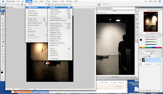
We used Photoshop to edit the image and make it more dark with a lot more use of shadow. Darkness is a very commonly used in horror movie posters. It is kind of like a code which tells the viewer that this is the horror movie. To make it more professional looking and similar to a real movie poster we added in production details.

Second Horror Movie Trailer Edit

After listening to the advice so I have given us and watching our trailer several times over, Jessica and I sat down and carefully went through our trailer adjusting every shot to make it as gripping as possible. First of all we cut down every shot so the viewer only gets to see a short snippet of the action. This will make the trailer of not more rapid and thrilling. We added production details at the end and a production company title at the beginning. These are two things that are always used in trailers to create interest around the stars in the film and the company which made it. We tried to make a film seem more edgy and other horror films. To do this the use of child was very effective. There is a short scene when one of the teenagers offers alcohol to the small boy this adds a new layer of rebellion to the commonly used stereotypical teenage horror film. The use of a child also heightens the drama and raises the stakes. A commonly used convention in horror movie trailers is the sudden and sometimes shocking use of abrupt titling. In our trailer the words break a leg flash up very suddenly hopefully shocking the audience and getting their attention. In the final edit we added the use of the 'wipe in' transition to give contrast to the dark scenery and make the abruptness even more shocking.

First Cut of our Trailer

Filming was very successful. We stuck very close to our schedule and managed to get all the footage we needed. I always set up the camera using the tripod because I made our storyboard and I have a clear vision in my mind of what I wanted the angles of each shot to look like. I tried to use some quite dynamic angles towards the end of the trailer as the shots get more fast pace. Some of the shots towards the end seemed quite disorientating but this adds to the rapid action in the trailer and will build a viewer's interest in the movie. I was in charge of editing the footage. Jessica was very helpful and we collaborated on ideas the whole way through. I have used iMovie many times before and know all about its tools and how to use its devices to my advantage. Before I started editing I looked through all of the transitions and titles together good idea of which ones I wanted to use. Titles and transitions can affect the style of the trailer. I got some very constructive criticism from my teacher. After watching the trailer a couple times over I realised that the beginning is very slow and entire trailer needs more pace. The shots don't have to be long but can still build tension which was a mistake I made with my first edit. This is only meant to be a teaser trailer not a theatrical trailer and does not need to be longer than two minutes. By making the shots very short the audience has enough time to take in what they've seen but are still very curious to see how the story will unfold.


Schedule and Preparation


In order to schedule our time properly we made this timetable on Microsoft Excel. When it came to filming it proved very useful because we knew the timeframe for how long it should take to shoot each scene of the trailer. This meant we could tell actors when we needed them and how much longer they had to work for. It made the entire process a lot more organised and driven. Our timetable also has a list of props and costumes that we may need to each scene. This came in very handy when preparing for the shoot. We used the timetable as a checklist so that we can tick off scenes we had done, props we had used and actors we needed.

Sunday 14 November 2010

Horror Magazine

As part of our horror movie campaign we has to make a magazine cover which advertised our horror movie. I managed to find this horror movie magazine in Forbidden Planet. It uses the typical horror movie colour scheme of black, white and red. The title font relates to Japanese horror which is thought of by many to be the country which most goriest horror movies. They have used a masthead to advertise the many articles which are inside the magazine. The image on the front is very different to a horror movie poster image. On the cover of a magazine the images are always a lot more commercial. In this one the stars are standing powerfully in the centre of the image. They are all holding weapons which shows that this magazine is tough and masculine. The clever slogan, 'bloody good show' slightly to it to show the chaos of the movie genre. Every part of the style and layout of the magazine relates back to the horror movie theme

Friday 12 November 2010

Copied Ideas

To make our trailer we have taken ideas from many famous horror film. This is because they have proved very sucessful and have become conventions of the modern horror movie. These are some of the ideas we reused;


The character of Emily, in our trailer, is similar to the character of Si
dney in the 1996 film, Scream. Sidney is adventurous, brave and tough. In the films she is always the last person standing. These are all characteristic that we repeated in the Emily. She is seen in the trailer fighting back.


Being trapped in an abandoned building is a very commonly used plot line in horror movies. When we were coming up with our story idea we had the style of the film House Of Wax in mind. The theater and the wax museum in the film are very similar in architecture and colour scheme. We wanted to recreate the same atmosphere.


The killer in our trailer is very similar to the killer in the film Halloween. They both wear white masks and carry a large carving knife. Using a mask is a commonly used convention in horror movies. It adds a large amount of mystery to the killer and the expressionless faces make them a lot more sinister.


Wednesday 10 November 2010

Unfortunate Recasting

Sadly on the day we decided to film our trailer two of our principal actors couldn't make it. Kyle and Hollie counselled on us at the last minute. Luckily we managed to find replacements which led to a rewriting of the synopsis. Jessica and I both agree that the new synopsis is actually a lot more original and exciting than the first one.

Ashlee Sutherland came at the last minute to play the character of Emily. She still has a very tomboyish look similar to Hollie. She is also very spunky and sassy similar to the character of Sidney in the 1996 film Scream. She is also a good actress with some acting training and is very charismatic which made her easy to direct.

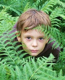
To replace the character of Morgan, Jessica asked her nine-year-old brother, Edward, to come along. This meant we had to change the character from Vanessa's boyfriend to her younger brother. I personally think this made the film a lot more exciting. Because the young boy added an element of incense which meant the stakes were higher in the action scenes. The idea of using a young child has been used many times before in horror movies. For example the Omen, the Grudge and the Ring. Edward has also had some acting training and is very comfortable in front of the camera.

Tuesday 9 November 2010

Title Ideas

When picking a title for a film it is important that you make the genre of the film clear and advertise the unique selling point. So the film it was important to think of a title which tied together the fact that it was a horror film and that the movie was set in an abandoned theatre. Some of the titles we came up with were;

-Final Curtain Call

-Kill The Lights

-The Cherub Theatre

There are a couple of commonly used conventions in horror movie titles. One of which is using a specific date in the title. For example Halloween, Friday the 13th and 28 days later. After taking this into careful consideration we came up with a couple more title ideas which included dates;

-Final Show

-Play Date

-Closing Night

to make the film seem a little bit more connected to the theatre in a less obvious way we started to think of commonly used phrases and sayings which you might hear in a theatre to incorporate into our title. This would link to a unique selling point perfectly. Our target audience is also around the age of aspiring young actors who will connect with a title like this. Some of these included;

-Break A Leg

-Stage Fright

-Curtain Call

in the end we decided that Stage Fright best suited our film trailer. This is because the word 'Fright' would appeal to a horror movie fans and makes the genre of the film quite clear. The word 'Stage' relates to our USP and advertises our theatrical setting. The film title is a phrase which is commonly used by actors. It doesn't have a date on it but we think it related to our film and our target audience a lot more.

Action Plan


So that Jessica and I could divide the work properly and organise what we still had less to do I made an action plan. It is important to divide up the work so that we don't waste time working on the same aspect of the project. I also put the date when it would be best to help them compete by on. This way we have a clear idea of the timeframe in which we are going to work.

Friday 5 November 2010

StoryBoard Animation!


I used iMovie to turn my storyboard into a short animation. This gives a better idea of what the movie trailer is going to look like. There are a lot of horror movie trailer conventions used in my animation. Firstly I think it is very iconic use the image of the man holding the blood covered knife above his head. This image has been used ever since films like Psycho came out. It is also in classic horror film Halloween.

Secondly using conventions like the sound of a beating heart instead of a melodic soundtrack. It is one of the most effective ways to build tension and suspense. The use of rapid images gives the trailer a very fast paced, dramatic atmosphere. Thirdly another convention which is used a lot in modern day movie trailers is putting the title at the end with one final shot after it. This will leave the audience wanting more.

Finally I have also used shot of a bloody girl getting dragged by her feet down a corridor. This image has been used many times before in horror movie trailers. For example in paranormal activity 2 and drag me to hell.

These titles also plays an important part in my trailer. The sounds they go behind them act as a shock to make the audience sit up and listen.
Another very important aspect in my trailer is the first couple of shots in which the dialogue is used to immediately set up a sense of character. For example, Emily, the fearless girl suggests they stay the night in a haunted theatre. Another example is when, Jacob, the scaredy-cat expresses his fear.

I unique selling point is also advertised in the trailer. There are a lot of the theatrical references. For example the prologue to Romeo and Juiet is recited at the end. Most of the mise en scène in the trailer also depicts a theatre space. For example spotlights and stage curtains.

The flashing images only give the viewer a quick glimpse of some of the horrific things that the movie is going to entail. This will hopefully have the audience desperate to see the film.


More analysis of horror movie posters


This poster screamed for is as effective for lots of reasons. Firstly the image is very distressing and shows a white distorted face. Fans of the previous movies will immediately recognise the iconic image of the scream mask which has been used in every film. The mask is also similar to the one in the very haunting painting 'the Scream'. Secondly the colours in the poster make it an instantly recognisable as a horror movie poster. This is because they are all very dark apart from a few uses of the colour red. Which is often associated with blood and passion. The title font is bold with a lot of sharp edges. This gives it a very menacing, masculine feel. The catchphrase at the top is written in red making it stand out among the other words. The words 'new decade, new rules' advertise the unique selling point. This is that the sale is the first to be set in the new decade and that the action is going on a more dramatic/higher standard. The date is easy to remember because it has a four in it, similar to the title of the movie. I think this poster is very effective because of minimalist style which makes it very dramatic, powerful and striking.

Characters and Actors


Emily played by Hollie Bowden
Emily is a strong, independent character. She is a bit of a tomboy and is not afraid to take risks or act on impulses. One of the commonly used conventions of horror movies is that the most innocent character always lives. We wanted our movie to be a bit more modern so none of the characters are stereotypically innocent. But Emily is very loyal to her friends and is often portrayed as the voice of reason. These kind of qualities work as reasons why she is the only one that survives at the end. We chose Hollie Bowden to play the role for many different reasons. Firstly she has short hair which is often connected with rebellious, tomboy type girls. Hollie is so very good at acting tough parts.


Jacob played by Joey Jarossi
Jacob is a commonly used character in many horror films. He's a character who was often afraid and wary about doing anything that could be potentially dangerous. The character is smart and articulate. In our film the twist is that he is also the killer. He's not the one the audience would suspect because he is normally too frightened to do anything violent nature. I will play the part of Jacob because I'm very good at pronouncing my words correctly. I also had the typical look of the smart character. I also have previous acting training.


Morgan played by Kyle Lo Monaco

Morgan is also a typical character commonly found in horror movies. Often referred to as the jock. He is good-looking, popular, athletic and is often going out with a pretty girl. We have arranged for Kyle Lo Monaco to play the role because he has all of these qualities. The character of the jock is never very smart and often dies at the end of the film. Our film is no exception. Also Kyle is ethnic meaning we can reach out to a wider target audience and the film will not come across as discriminatory.


Vanessa played by Jessica Stevenson
Vanessa is also a typical character that appears regularly in horror movies. The pretty, popular girl. This kind of character will often go out with the jock. This is a convention that we have used our film. She is also not very bright and ends up being killed when she wanders off in only her underwear. Jessica was the perfect person to play this part because she is a very experienced actress and is also very pretty and image concerned.


Thursday 21 October 2010

Synopsis

31 years ago in The Cherub Theatre a 7 year old boy was laughed off the stage when he forgot his lines, which led him to commit a violent suicide.
Now, in the modern day, 4 teens, Emily, Jacob, Vanessa and Vanessa’s boyfriend Morgan are sat in The Cherub Park looking for something to do. The outgoing and fearless Emily suggests they stay the night in the abandoned, supposedly haunted Cherub Theatre. The loved up couple, Vanessa, the girly girl and her handsome boyfriend Morgan are easily convinced whereas skeptical Jacob votes against it. After a while of reassuring him everything will be okay, Jacob doubtfully agrees. After telling some scary stories and eating some junk food Jacob wanders off to find the furnace. Whilst he is gone, sitting in darkness, the girls and Morgan hear crying from downstairs. The lights come on and when Jacob re-emerges he tries to reassure them that it was not him crying. They carry on as if nothing had happened, but suddenly the lights blackout. In the confusion Vanessa reveals a deep scratch in her arm. When the lights come back on they discuss who might have been the culprit and discover Emily has blood on her hands making her seem very suspicious. Now feeling very freaked out they try to leave the building but discover that all exits are now locked. The girls try to uncover how they got locked in whilst in the theatre Jacob is being possessed by Little Benjamin (the boy who committed suicide 31 years ago). The girls go back into the theatre to find Jacob sat in the front row of the audience. They ask him 'what's wrong?' and he replies in a whisper. 'I'm rehearsing'. The girls go to get him some water but when they return to the theatre he is gone. They hear a noise from upstairs. Thinking it might be Jacob they go to investigate. They look everywhere but cannot find him. They decide to split up. Finding nothing, they all come back together. At this point the real chase starts as they see a masked figure standing on stage. Running, tripping, crying, they all try desperately to escape this hellish building. Emily has found herself back in the main theatre on stage alone. Breathing heavily, Emily backs up towards the wall as she hears a voice reciting the opening prologue of ‘Romeo and Juliet’. As the voice reads the line ‘A pair of star cross’d lovers take their life’ the camera reveals the masked figure standing behind Emily. Finally finding a quiet and safe looking room, Vanessa and Morgan realise Emily is no longer with them. Morgan tells Vanessa to stay where she is and hide while he goes to rescue their friend. Meanwhile Emily finds a secluded room, in which she enters, to find many pictures of Little Benjamin all over the room. When Vanessa is on her own she gets brutally murdered by the masked figure. Finding Emily with a room full of Benjamin pictures Morgan states how much Benjamin looks like Jacob when he was younger. Realising Vanessa is alone they rush to her aid. Emily and Morgan find her dead and the killer is nowhere to be found. Jacob comes in and immediately starts reassuring them that it was not him that murdered her. They all try hysterically to escape the theatre. Jacob gets possessed right in front of them as he finds a weapon and immediately starts trying to kill them. There is a struggle but eventually Jacob kills Morgan. After the deed is done he stands in the middle of the theatre with the two dead bodies lying around him and recites the opening prologue to Romeo and Juliet.

Wednesday 20 October 2010

Location


The number one most important thing for creating atmosphere in a horror movie trailer is the location. Our film is set in an abandoned theatre. We both attend regular classes at the Young Actors Theatre in Islington. We have asked permission to film in the theatre after the classes have ended one weekend. We are also going to set a couple of scenes in the old adventure playground across the road from the theatre. The theatre from the outside has a very institutional feel, similar to a prison. It is also fallen into a state of disrepair making it look as if it has not been used for many years. The inside interior is very dark and old-fashioned. There are a lot of hidden doorways and dark corridors which will provide an effective backdrop for trailer. The theatre in real life is supposedly haunted and definitely has the feel of a haunted building. The park across the road has also fallen into a state of disrepair. It has a very depressing and haunting feel to it because it obviously used to be a fun child friendly play area but in recent years has become rotting and dangerous. This reminds me of the location in the film House of Wax because that to used to be a happy, family friendly place but in the film has become a wasteland of hellish nightmares. This is the feel we want to replicate in our trailer.

During the night-time the scary atmosphere is enhanced and will provide the perfect location for a trailer.

Friday 15 October 2010

Props


These are images I collected to create a kind of mood board of some of the commonly used weapons in horror movies. The research showed me that the weapons are often things found around a household or garden shed. This might be because it adds to the realism of the danger in horror movies. Our horror movie is going to be set in a theatre so it is important that the weapon is something that could possibly be in theatre. The use of blood in a horror movie is also very important. Blood is iconic.

Monday 11 October 2010

Target audience research

Monday 4 October 2010

Recognising plot conventions

I went on to IMDB and printed out part of the synopsis to the 2009 film 'Jennifer's body'. Then I went through it using different coloured highlighters and highlighted the key elements of the horror movie genre. Including stock characters, plot and stock situations, themes and backgrounds and decor. I realised that most horror movies contain some kind of mystery. This is so that the audience feel anxious which sets them up nicely for any scary moments. I then sat down with my other team member, Jessica, and we looked through the differences between a movie she had highlighted, 'Nightmare On Elm Street' and 'Jennifer's body'. Both plots included are lots of gore and blood. They also both had main protagonists who seemed harmless and defenceless. The villain in both films was someone out seeking revenge and at the beginning they seemed unstoppable. During this lesson I found out that all horror movies that their characters in a situation which seems impossible to get out of because this will always build a lot of tension.

Monday 27 September 2010

Applying recognisable conventions of trailers


In order to play with the recognisable conventions of trailers, in groups we came up with the idea about how to market and promote a new horror film called Bloodshed High. To begin the task we made a list of all the conventions we saw in a typical movie trailer.

-Highlighting the best bits of the film (whether they be very funny, very sad or action packed)

-We are not necessarily shown the story in chronological order

-The famous actors or director in the film are always highlighted. This is a very effective way to get the fans of the stars to come and see the film.

-We are normally given a small glimpse into the character's personality through one line soundbites

-At the beginning of the trailer we are often shown the normal day-to-day life of the main protagonist

-So that the audience gets a good idea of the genre the production company is always highlighted somewhere in the trailer.

-Voice-overs or text often pop up on screen. They are often in the form of a rhetorical question. This builds anticipation.

-Music plays an important role in creating atmosphere and building a strong sense of the genre.

-The title never appears until the end. This is so they know they have the audience's attention by the time they give away the title.

-Trailers in nearly always builds to a climax where it will end. This builds anticipation and makes the audience wants to come and find out how it ends.


After we had built up a substantial list we started to think about how we could challenge the conventions to promote a unique selling point.

We began our trailer with a shot of a production company Twisted Pictures. This will immediately draw the attention of horror film fans because this production company is well known for making the best horror films. After that we were going to have a slow fade into an establishing shot of a boarding school on an island. The next shot will show our main character going through a normal school day. It is important to show these shots because it sets the scene and gives the audience an idea of the norm. This will give the action more impact when it begins. The young boy who plays the main protagonists will be played by a rising young British film star for example Nicholas Hoult. Because he is considered a serious actor he will appeal to the film's demographic. The shots start to get faster after the boy discovers someone dead at this point the pace of the trailer begins to pick up along with the action. The music which before now was very slow will start to build in volume and tempo. This makes the action more thrilling and sets the atmosphere perfectly. We have decided not to use voice-over because they are quite outdated and we want to sustain a sense of realism. We will not give away who the killer is or whether the boy lives or dies because this will make the audience curious and more likely to buy tickets.

Burton's more than meets the eye

After reading the article I now know that the best way to advertise any product is through repetition. Because more often than not it's something is repeated over and over again the public begins to accept it and remember it. This is also true with film genres. An audience will understand what genre film is because they have seen other films like it many times before. The variations on the genre are what make the unique selling point.

I've mentioned in a previous post many of the different key elements that construct a genre. These include

the protagonist also known as the main character,

the stock characters these are other minor characters that contributes to the genre,

the plots and stock situations also known as the typical storyline which is recognisable specific to its genre,

the icons which are part of the mise en scène and our icons or symbols of the genre,

the backgrounds and decor most film genres have a place where they are normally set,

the themes for example revenge, community and more.

Every movie genre has its own formula. This means that the mixture of the plot, the characters, the setting, the themes, the mise en scène and the protagonists all go towards making up the specific genre. For example in action adventure movies the audience will often expect the film to star a heroic, fit young man. They will also expects the main protagonist to be put in dangerous situations.

Wednesday 22 September 2010

Defining movie genres

In today's media lesson we learnt about what defines a movie genre. Each movie genre specific conventions. It is similar to a maths equation. Every movie genre has a formula. The plot will often have key elements that are the same for others in its genre. For example sci-fi films are almost always about alien planets going to war with Earth. The type of characters you find in a certain movie helps you understand what genre it falls into. For example Western films will always have cowboys and indians. Westerns are also predominantly about a group of people trying to keep the peace in a small community in western America. The setting of a movie can also tell you a lot about its genre. For example a teen movie will almost always have some scenes set in a high school. Another way the audience can tell what genre movie is is by the way it uses the atmosphere to manipulate how the viewer feels. For example horror movies will often have a dark atmosphere (the predominant colours in most shots might be black or red). This is to make the audience feel nervous and scared. Musicals will always make the audience feel a sense of community spirit and overall happiness by the end. The mise en scène plays an important part in the genre of film. For example a sci-fi film like Star Wars will have a lot of futuristic technology and spaceships in the background. The weapons they use are also futuristic which is in keeping with the films are genre.

So I learnt that every movie genre is constructed by its use of setting, mise en scène, characters, historical background and overriding themes.


Thursday 16 September 2010

Getting Put In our Groups

A couple days ago we got put in the groups we are going to be making our horror movie trailer in. Most people putting groups of three but I got put in a group with my friend Jess Stevenson. We already have a lot of ideas for our horror movie trailer but to start off we decided to divide up the work. Jess is in charge of getting the actors and finding the location. It is important that she considers how much time we will have in the location, how good it will be the filming (for example lighting, space, and more) and whether it fits our vision. My job is mostly editing and cinematography. We're going to work together on coming up with the story, storyboarding, production and filming. I quite like the idea of only having one other person in my group it makes it easier to collaborate and get across ideas.

Brain Storming Ideas For Our Horror Movie Trailer


Friday 10 September 2010

What is more important in a movie trailer sound or images?

I personally think that in a movie trailer sound and images go hand-in-hand. Because even though an image can be very powerful it doesn't build atmosphere and mood as well as if it had been coupled with music. At the same time sound effects can build drama but for advertising a film it is better to have images. This way you can build tension with silences and you can also advertise the stars in the film.

Analysis of a Movie Trailer - Step Up 3D


As research I decided to analyse the movie trailer the new film step up 3D. Throughout the entire trailer there is a variety of hip-hop dance songs from famous artists. I find it very telling that the names of the actors are not credited but the names of the singers who perform in the film are.
This is so they can market the film towards a generation that cares less about famous directors and more about chart-topping singer's. The title of the film does not appear on screen until right before the end. This is so the trailer is building up and building the audience is anticipation. It is also not as important to them to show the titles at the start because there has already been two step up films and the brand already has an established fan base.
Because this is a dancer on we see very little conversation in the trailer it is mostly rapid images of contemporary dance moves. These images mixed in with the hip-hop music advertises the film as being very youthful and passionate. There are lots of flashing lights giving the trailer and nightclub atmosphere which will be appealing to its teen audience. There isn't a voice-over but slogans appear on screen. For example at the beginning of the trailer the words 'it is time to step up' appear on screen this gives the audience a clue to what the film is about and helps to build anticipation. All of the shots and titles are cut together in time with the baseline of the music. The shots do not give away much of the narrative that they show a fast paced party like atmosphere similar to a music video. When the music does occasionally stop it allows the actors to say cheesy catchphrases like 'what he saw before is just the beginning' and 'everything you need to know is in the way I dance'. These quotes add to the passion of the film and tell the audience that this time the stakes are higher which might be the unique selling point for this particular dance film. Another unique selling point might be the fact that this is the first to step up film to be in 3-D. In the last frame of the trailer we are showing who directed and wrote the film. This tells me that the marketing team behind this film obviously thought that this information would not be an important selling points for the film. The last frame also tells us the website where you can download the soundtrack. This highlights once again that the soundtrack in many ways is more important than other aspects of the film.
In this case I think the trailer is more effective than the poster in making me want to see this film because as I've mentioned before the soundtrack is an important part of this film and also it gives you a strong sense of the dance aspect in this film. I would expect to see this trailer before seeing a wrong, or kids film because it is 3-D which normally attracts young children and the contemporary dance/party lifestyle atmosphere will appeal strongly to preteens. I also might expect to see this trailer on channels such as E4 or Nickelodeon because they both cater to a preteen audience.