 Original image
 poster after final edit
After filming our trailer we left some time to take some photos for the horror movie poster. We had already drawn a couple of rough sketches and discussed what we wanted our poster to look like. We wanted to combined horror movie poster conventions and the themes and iconography of the theatre. The unique selling point in our film is that it is set in the theatre. There is always a lot of mystery in the image for a horror movie poster, it normally does not give very much away. I came up with the idea that we have an image of an empty stage with only a single spotlight highlighting a dead woman holding the mask the killer was in the movie. We decided that this would be a good idea because the concept and the image itself are both very chilling and mysterious. I thought was a good idea that we do not show the killer in the poster. The mystery will build curiosity and make people more intrigued to see a film. Jessica came up with a very clever idea of having people sat in the audience. This enhanced the strange and creepy atmosphere which will draw people to see the film. We decided to have the title on a slight slide to give the idea of chaos. After getting some audience feedback we found out that we had slanted it too much and it was blocking the image so we moved to our. 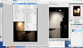 We used Photoshop to edit the image and make it more dark with a lot more use of shadow. Darkness is a very commonly used in horror movie posters. It is kind of like a code which tells the viewer that this is the horror movie. To make it more professional looking and similar to a real movie poster we added in production details.
We used Photoshop to edit the image and make it more dark with a lot more use of shadow. Darkness is a very commonly used in horror movie posters. It is kind of like a code which tells the viewer that this is the horror movie. To make it more professional looking and similar to a real movie poster we added in production details.
No comments:
Post a Comment